Monday 27 December 2010

Doodle book update…

I have been doing my daily sketches though not consistently. I’m rubbish at scanning them all in, I never remember!

Here is a backlog of them for you to peruse…

002 003 004 013005

I have many scruffy sketches of scenery my car window, all of which look like masses of squiggles. These three are the best of a bad bunch.007

   009 011 012008

My nana has been poorly over Christmas, so I have been spending a bit of time at the hospital staring into space! The last 5 pages are sketches of patients.

The hospital decided to put Christmas songs on loop in the waiting room we had gathered in. After hearing Santa Baby for the 5th time, it’s no wonder most of the patients look ready to commit mass suicide.

Thursday 9 December 2010

Level Design

Previously, the title ‘Level Designer’  brought to mind a single lucky fellow spinning out level ideas of which were instantly transformed into reality by a group of obedient artists and modellers. They continually work with visually compelling imagery and.. well  ... I actually assumed it was a fairly easy job. How naive.

The amount of planning that goes into each of the designs is phenomenal. Building a successful map is an art form in itself. Working up to the final design requires a lot of trial and error before you get something challenging and entertaining for the player. Often they fail even after all of that effort… it’s not an easy job!

intro

Before any artwork is involved the team meet and discuss ideas. Intense planning and research ensues resulting in sketches, mood boards and check lists. After approval simple geometry is blocked out in 3D and shoved in front of any play tester they can get their hands on. This constructive input is put into consideration and the level is tweaked until unrecognisable.

Only then is the level given to concept artists to paint-over who work on the overall look of the level. It is then passed off to environment artists who make further tweaks and changes, adding level after level of detail until happy with the finished art.

Half Life 2 has a particularly successful level design. The maps have clear direction without feeling too constraining and the environments feel familiar enough to be believable. All of the levels flow beautifully and you always have a clear sense of where you are heading. Each level climax has been unmistakably imprinted into my brain, and I remember them clearly and fondly!

To me a successful level keeps the player moving at a consistent pace. I instantly feel underwhelmed when I think I have found a secrete passage that leads to loot but instead discover a mindless barricade or dead end. I feel betrayed as a double back on myself with nothing shiny to distract me. I think all paths should lead to a destination, even if the loot at the end simply consists of a worthwhile view – a tactic  beautifully executed by the Uncharted games…

uncharted1

I also appreciate feeling orientated. Massive, complicated levels make me feel lost and panicky before I even get the chance to defeat any foes. If I haven't got a map, I find being able to see my final destination reassuring. Distinctive markers and worn paths help me keep track of where I have been and simply catching a glimpse of the destination in the distance acts as a comforter. I don't appreciate being surrounded by enemies whilst  feeling impossibly lost!

Saturday 13 November 2010

Work…

… from the Loughborough train station. We visited near start of term but I never got round to posting them up. 

   Thumbs…

img076  img080

img082

..and a final.

Trainfinal

Composition

“To take photographs means to recognize – simultaneously and within a fraction of a second – both the fact itself and the rigorous organization of visually perceived forms that give it meaning. It is putting one’s head, one’s eye and one’s heart on the same axis.”

-Henri Cartier-Bresson

Bresson happens to be one of my favourite photographers. I love how his work oozes mystery and character.

exhb_87-699x1024 

henri_cartier_bresson003

He is a master at compositional photography…

A_Gaudi_tribunal_spaceship

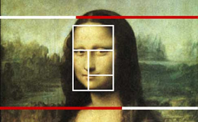
This one in particular uses the golden ratio. How the brain and eye work together is fascinating stuff. Certain shapes and proportions are easier for our brain to decipher. Adrian Bejan, a professor of mechanical engineering at Duke University, in North Carolina, has made some interesting discoveries in the field of theoretic mathematics. He claims that the human eye is capable of interpreting the golden ratio proportions faster and more efficiently than any other shape.

2345637782_54d673d06a_z

That would explain why so many of the old masters of art use these proportions in their work. Leonardo Davinci, Salvador Dali and Botticelli to name a few.

The Last Sacrament by Salvador Dali

image43 venustek1

With the help of composition we can determine what we intend to make the viewer look at first, where they will travel and finally come to a halt. I have a geeky interest in finding pleasing compositions, particularly in photography. Oddly, I have only just implementing the same rules in some of my paintings. I guess I never put two and two together. I find it a lot more natural to think about things like leading lines and framing with a camera up to my face - though I have recently made much more of an effort to play around with composition in my thumbnails.

Although we concentrated quite heavily on composition in my photography course, I have learnt quite a bit more since starting Game art and simply researching on the interweb. I first planned to outline all of the aforementioned rules and give examples, but looking around, there are plenty of places that do that for you. Here is a particularly good one. Here is one that will entertain you with ridiculously out dated pictures but relevant information. Although both are aimed at photographers, I think the rules are interchangeable.

Here is an incredible resource for everything from composition to art materials. James Gurney has been a constant inspiration to me, and his blog is a gold mine of interesting articles and tips on how to become better artist. These two are my favourite blogs he has written with a compositional theme.

Some bullet points to outline the things I feel I still need to work on:

- Never run out of space, judge distances and proportions first before adding detail 

- Use a pencil as a measuring stick using this technique (I really need to do this more)

- Play with light and contrast to guide the eye

- Remember my contrasting colours from school. Keep an eye on colour temperatures and how they create atmosphere (warm colours draw attention, cool colours create space etc.)

- Be more creative with negative space

- Watch my object grouping ( i.e. a balanced piece reflects symmetry, calm and order and  an asymmetrical piece may draw attention to a point of emphasis or create disorder)

Here’s an interesting article on composition. The link takes you to one of my favourite page of tips on the site, but take a look around, it’s pretty useful stuff:top_logo

Wow, I think I have used too many hyperlinks in this post. Sorry.

Doodles

IMG_0001 IMG_0002

Sunday 7 November 2010

Richard Preston


1_Sunrise600-8

Sunrise

2_oceansediment_600-8

Ocean Sediment

3_verdant_600-8

Verdant

“Preston's work is imbued with the themes of relatedness, rootlessness, displacement and home; how universal forces replicate in the human the same forms exhibited in the Earth: the cycle of mountain building, the evidence of tectonic action, the forces of growth and decay, erosion - how a discontinuous continuity can be discerned through an in depth, patient observation and how we, as self-conscious beings, struggle to find personal relevance in this vast cosmos” – Prestville Art

I love that description.

This is Richard Preston's work with beading and textiles. These squares of colour remind me of my home! My family collect paintings, tapestries and statues from all over the world and most are laced with colours and beads much like these.

Sketches from the last few days…

IMG_0010 IMG_0011 IMG_0014 IMG_00017

Urgh… yuk.

Though these horrid little sketches are simply speedy observational doodles, I cant help but feel disheartened when they turn out so. Darn. Shoddy.

Note to self: Must remember that PRACTISE MAKES PURRFECT.

Friday 5 November 2010

Drawing Bradgate Park

Some watercolours…

Untitled-2

Some inks….

Untitled-1

Some sketches…

Untitled-1aUntitled-1n

A final prep…

IMG_0007

And a final piece! Here is the digital painting…

bradgate1

Must speed up.

Wednesday 3 November 2010

Bradgate Park…

… was cold but beautiful.

DSC_0484

DSC_0595

Planning

As a small child, my Dad always loved photography – he took me along on walks through the patchy woodland near our house. Armed with his old camera, he allowed me to explore and actively encouraged every photograph that I took. I remember hundreds of photo albums brimming with pictures of great oaks and autumnal forest scenes that he had shot, and in between these beautiful photos sat my masterpieces – mostly out of focus  ladybugs and spiders. With his help I learnt a lot about composition and lighting and I blame him for my true respect of nature…. mainly trees!

Whilst continuing on with my A-levels, I took a Photography foundation class at my local college. Here they taught me the technical jargon and how to work an SLR. The composition lessons worked a treat too – I learnt how to lead the eye through a scene with horizontal and vertical lines, and how to add interest to a dull piece by using nearby objects as framework .

When I began this Game Art course, I forgot all of the lessons learnt throughout my childhood/education… perhaps because I was so nervous and eager to please or just constantly running out of time! Now my second year of uni is in full swing, I have noticed a few changes in my work flow and decision making. The way I think about planning and composition has completely changed from those first spidery sketches I made in the first year. I feel far less hassled by my lack of planning and can now concentrate on being the best I can be. I am re-learning to recognise an aesthetically pleasing shot, rather than jumping straight into the work to get it done. I am using my thumbnails as experimentation, instead of doing them because I was told too. I am working with the final piece in mind, and I can see a huge improvement in the finished work!

Tiny first year thumbs::

canalP Larger, far better second year thumbs:

img07img082

Reading this article about art processing has really intrigued me. The article touches on aspects of planning I would love to get to grip with. She introduces the tutorial with:

“ This entire lesson is about why (in this image) there is a tree. Why there is snow. And why they are in their precise positions. It’s about the thought process surrounding the understanding of purpose and discerning detail to create a mood to achieve your concept. ”

The point of the article is the importance of using references. She mentions using them for every last detail you paint, because drawing from your imagination is hard work, time consuming and often flawed. I need to get in the habit of taking more pictures and looking out for inspirational scenes. Luckily, I have done a lot of photography before the course and over the summer managed to sort all of my pictures into some sort of filing system. Turns out I have a LOT of tree pictures and bark textures. But.. I need MOAR!

A further two quotes from the article that I particularly agree with:

“ If the thumbnail is not successful, it does not matter how
good the painting is, it will be less than it can be ”

“ If I squint my ‘minds eye,’ what shapes do I see? ”

image

I have only just started implementing this in my own work. Before, thumbnail just spurted out of my pencil in a hurry to get themselves done. I then just ad-libbed a final with hardly any reference and a lame little sketch. Now I only do a final once I am happy with a chosen thumbnail. Editing composition and perspective is far easier in a crumby sketch then a fully rendered final piece!

Today’s sketches…

IMG_0002

Some rather warped piggy snouts…

IMG_0001

… and a cheese plant.

Tuesday 2 November 2010

Need… More… Speed

In an attempt to speed up my drawing I’m going to bring a small  sketch book and pencil with me in my handbag. I aim to fill (at least) one page everyday with quick relaxed sketches. I’m not worrying too much about form or style in these quick scribbles, just speed and consistency.

Hmm… and to get over my fear of others judging my work, I will post them on here… even if I feel ashamed!

So here is today's page…

IMG_0004

…!

Sunday 31 October 2010

Abbey Park

I haven't touched watercolours in a while! This is my attempt at a fairly overcast Abbey Park…

Image (14)

The scan really bleached out the detail in the sky :/

I find it very hard not to over saturate my watercolours. I think the orange on the right hand side of the picture is far too bright, and distracts the eye. I’m fairly happy with the composition though, perhaps a little more detail in the water would have created more convincing reflections.

Here’s my digi paint:

AbbeyParklarge

I toned down the colours a little, and made the fountain more of a focal point. Pretty happy with this final result though I do feel like the overall image is a bit bland?